Absolute Lifestyle
Absolute Lifestyle is an operating supplies and equipment company active globally and established in Hong Kong for two decades. The company takes pride in developing refined design made from valuable materials and unique quality.
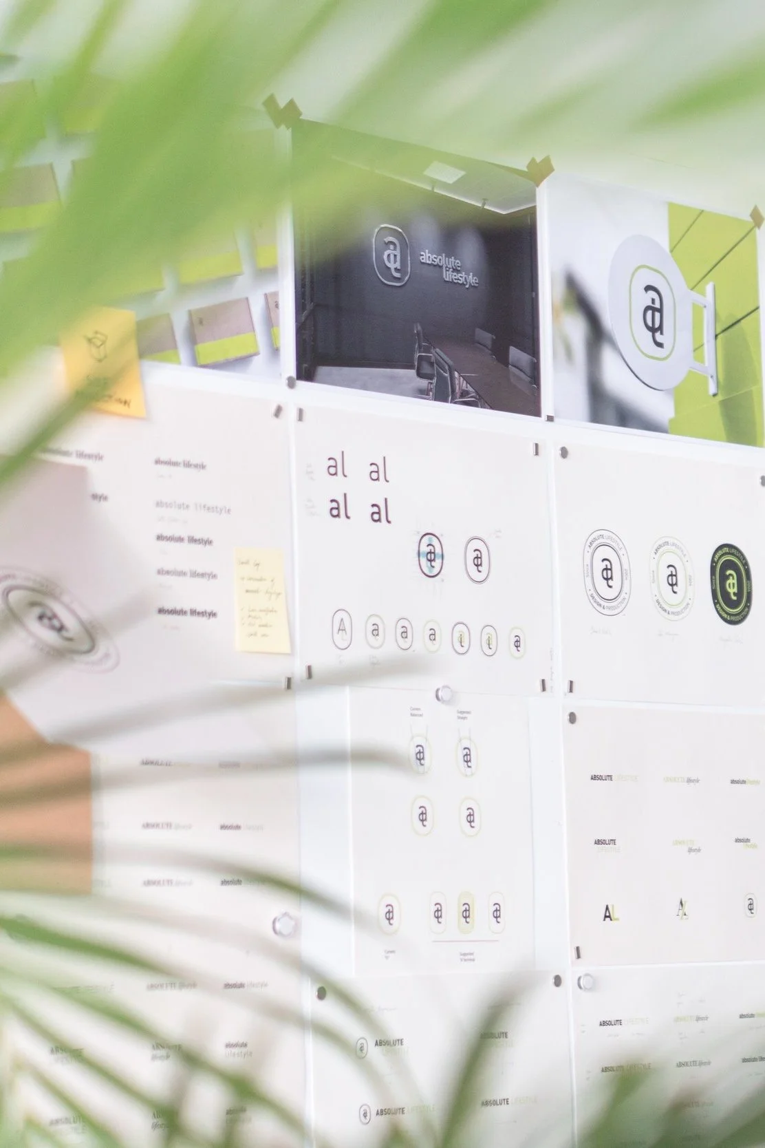
We understood the importance of preserving the essence and legacy of our client's visual identity while also injecting a fresh perspective into their brand.
By approaching the project as an iterative process, we were able to carefully refine and enhance elements of their existing graphics rather than completely overhauling them. This approach allowed us to maintain continuity with their established brand.

Year
2023
Sector
Hospitality
Disciplines
Market Research
Brand Strategy
Brand Identity


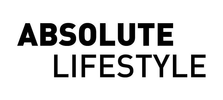
Logotype
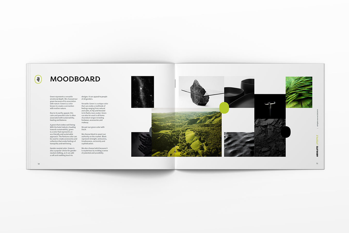
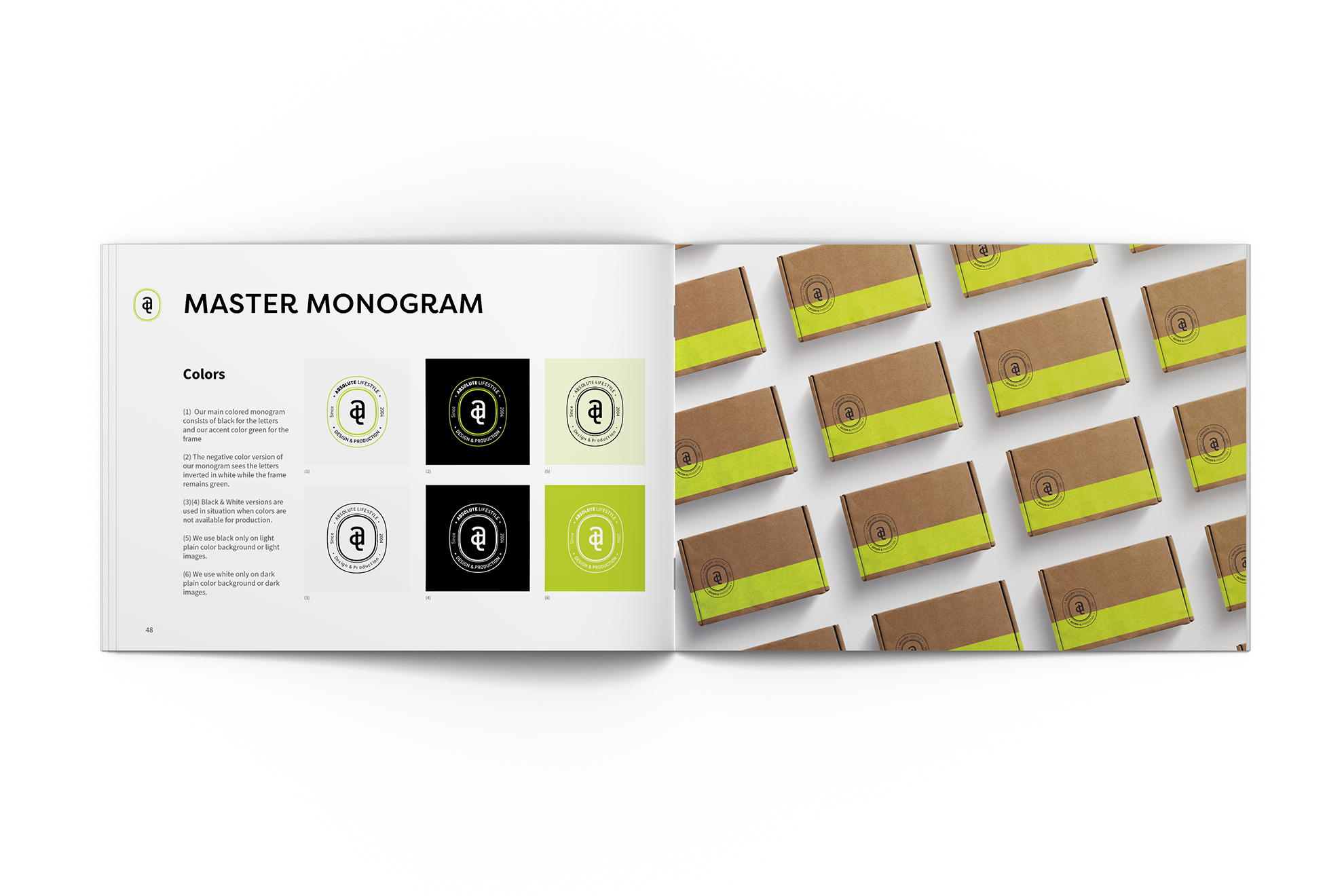
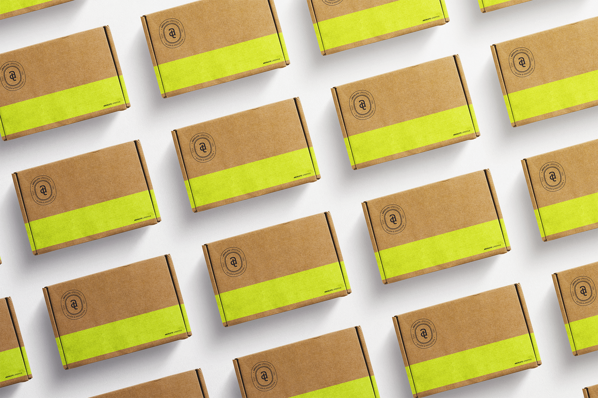
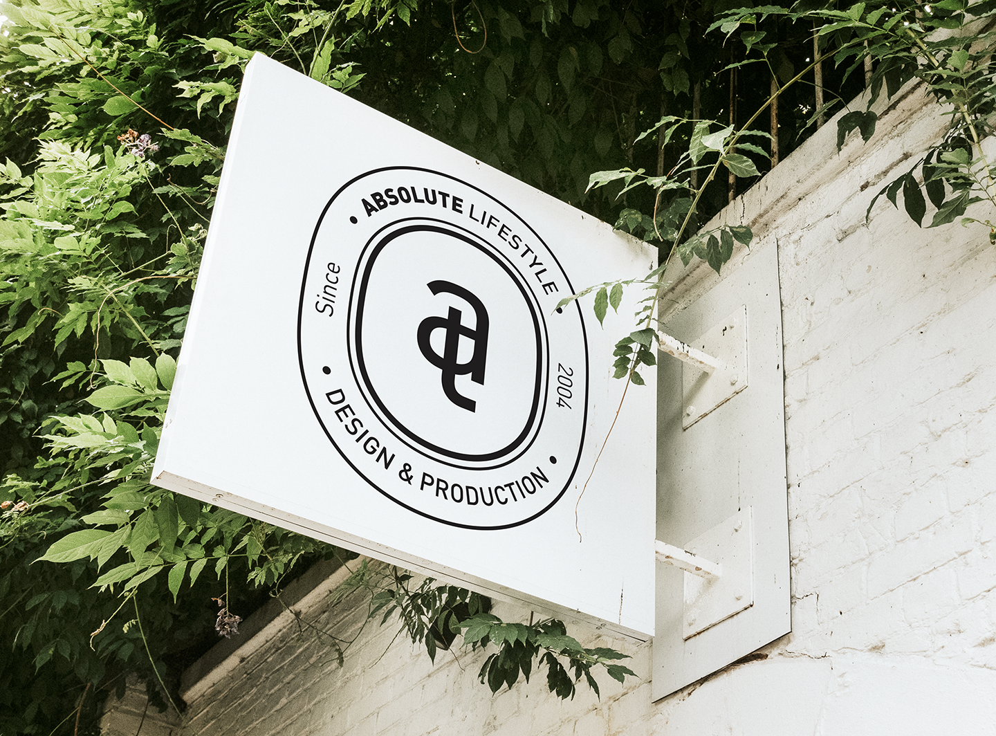
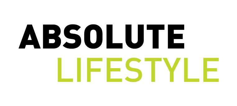
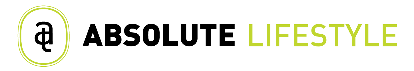
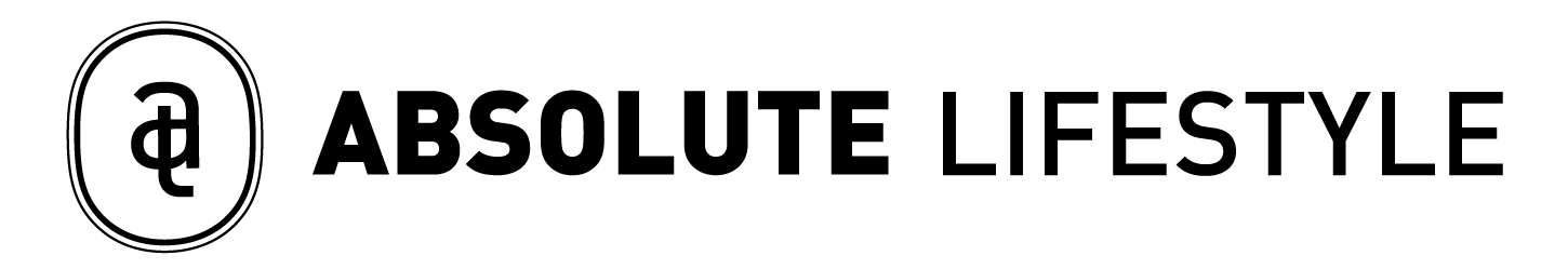
We designed the logotype to be conceived with a modern and contemporary font: DIN. The sustainability aspect is reflected in the company’s signature green color, echoing their commitment to sustainable values.
The modernity of the font conveys sophistication and professionalism, with the extra weight emphasizing the meaning of "Absolute."
The contrast between the bold weight of "Absolute" and the regular weight of "Lifestyle" helps anchor the reader's eye on the brand name.
By setting the wordmark in capital letters, we assert authority and experience in the industry, establishing the company as a trustworthy and reliable choice for hotels seeking a sustainable product range solution.