Intouch
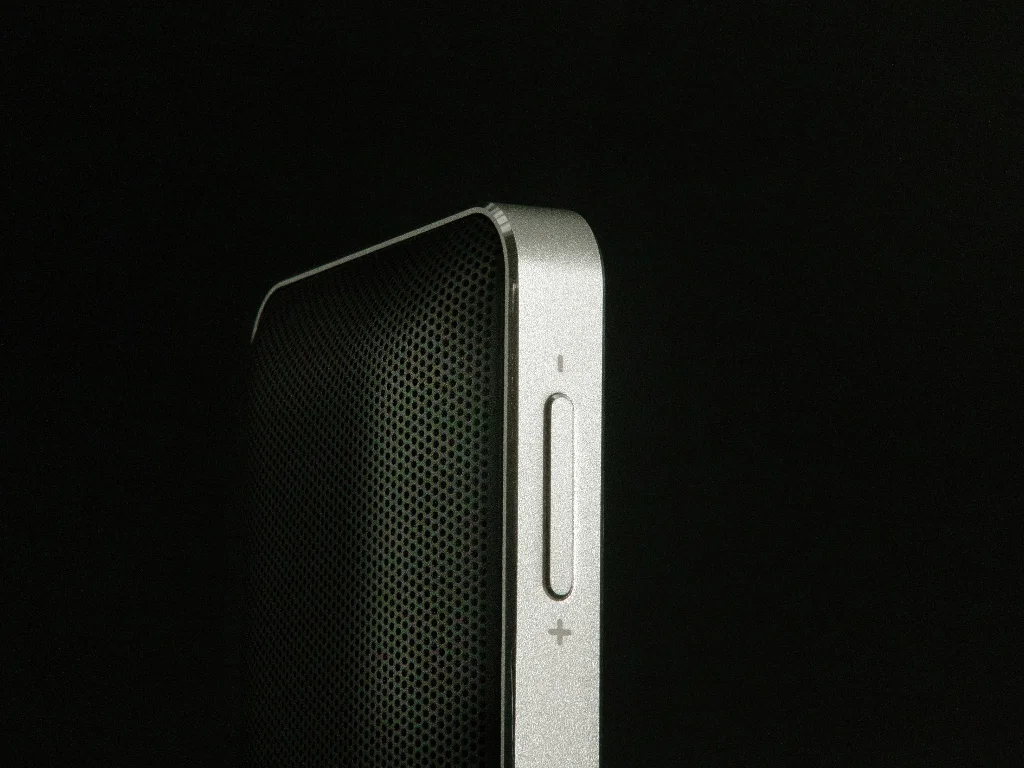
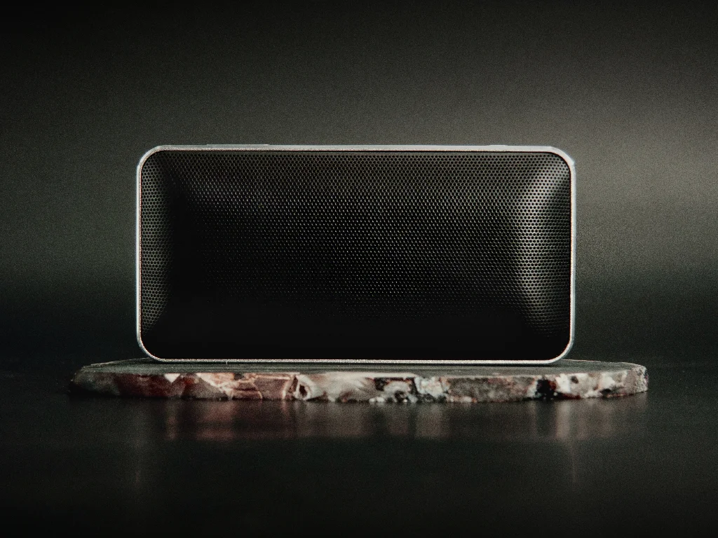
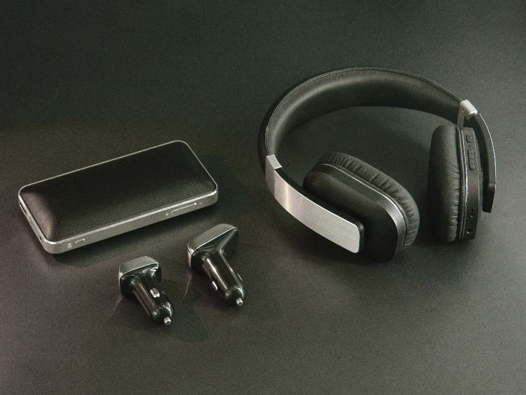
INTOUCH is a market-leading brand specializing in smart connected products and mobile accessories.
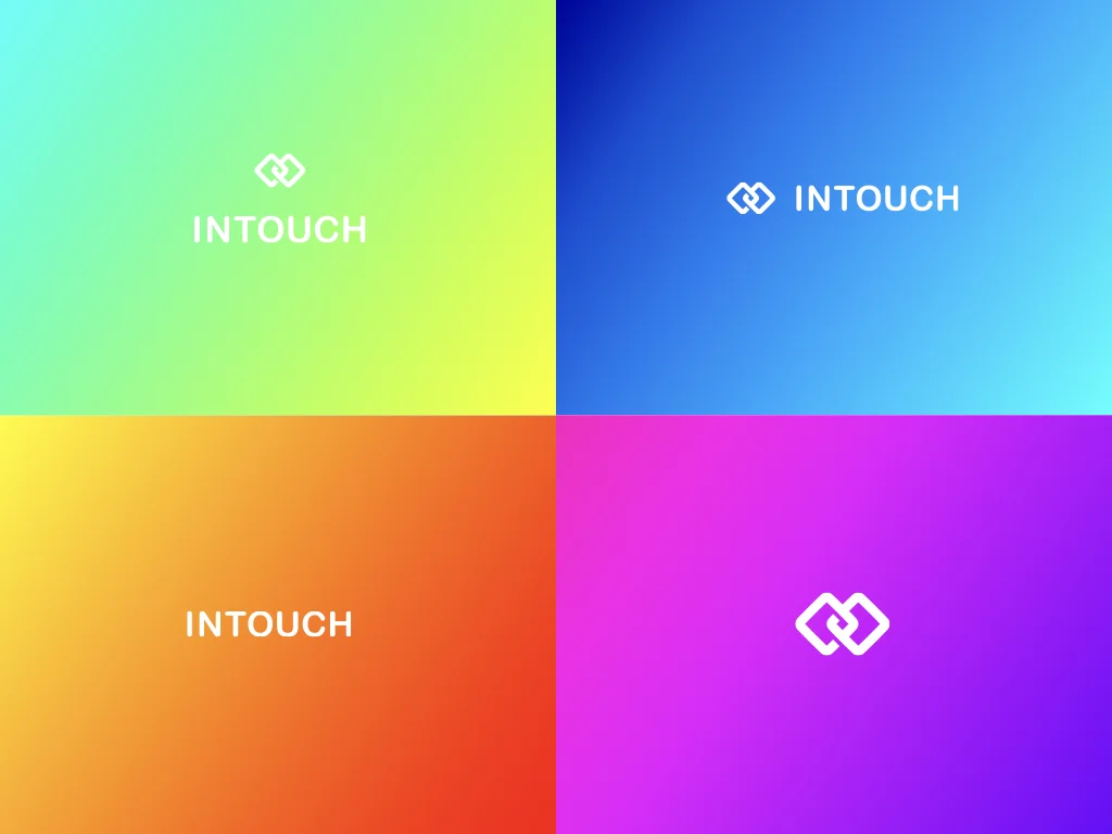
Our role in their rebranding was to revamp their identity to cater to a dynamic and mobile audience. Taking into consideration the fast-paced nature of the tech industry, we knew that it was crucial for INTOUCH's new identity to reflect connectivity and communication. To achieve this, we designed the monogram in the shape of a link, symbolizing the importance of staying connected with one another in today's digital age. This subtle yet powerful design choice not only conveys INTOUCH's commitment to keeping customers linked up but also reinforces their position as a telecom accessory brand at the forefront of innovation.
By infusing their new logo with such meaning and purpose, we were able to create an identity that truly resonates with their target audience while setting them apart from competitors in the market.
Year
2018
Client
Sector
Telecom Accessories
Disciplines
Strategic research
Colour, material and finish
Brand development
Photography
Web Design
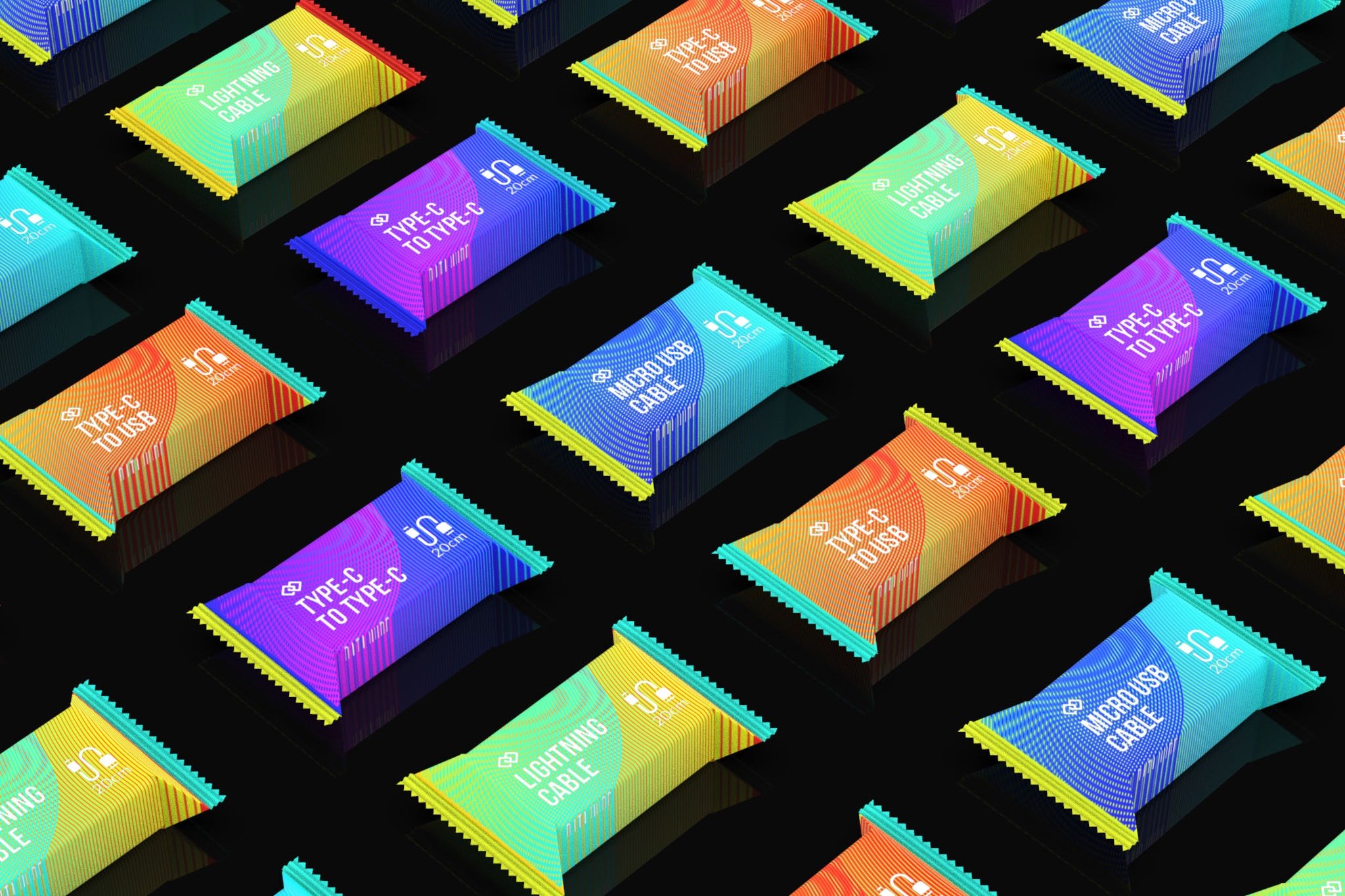
Packaging design
Art direction