iCleanic Identity
iCleanic is a Hong Kong-based healthcare company, leveraging transformative technology as it manufactures, markets and distributes personal, commercial and robotic sanitisation devices for a post-COVID world.
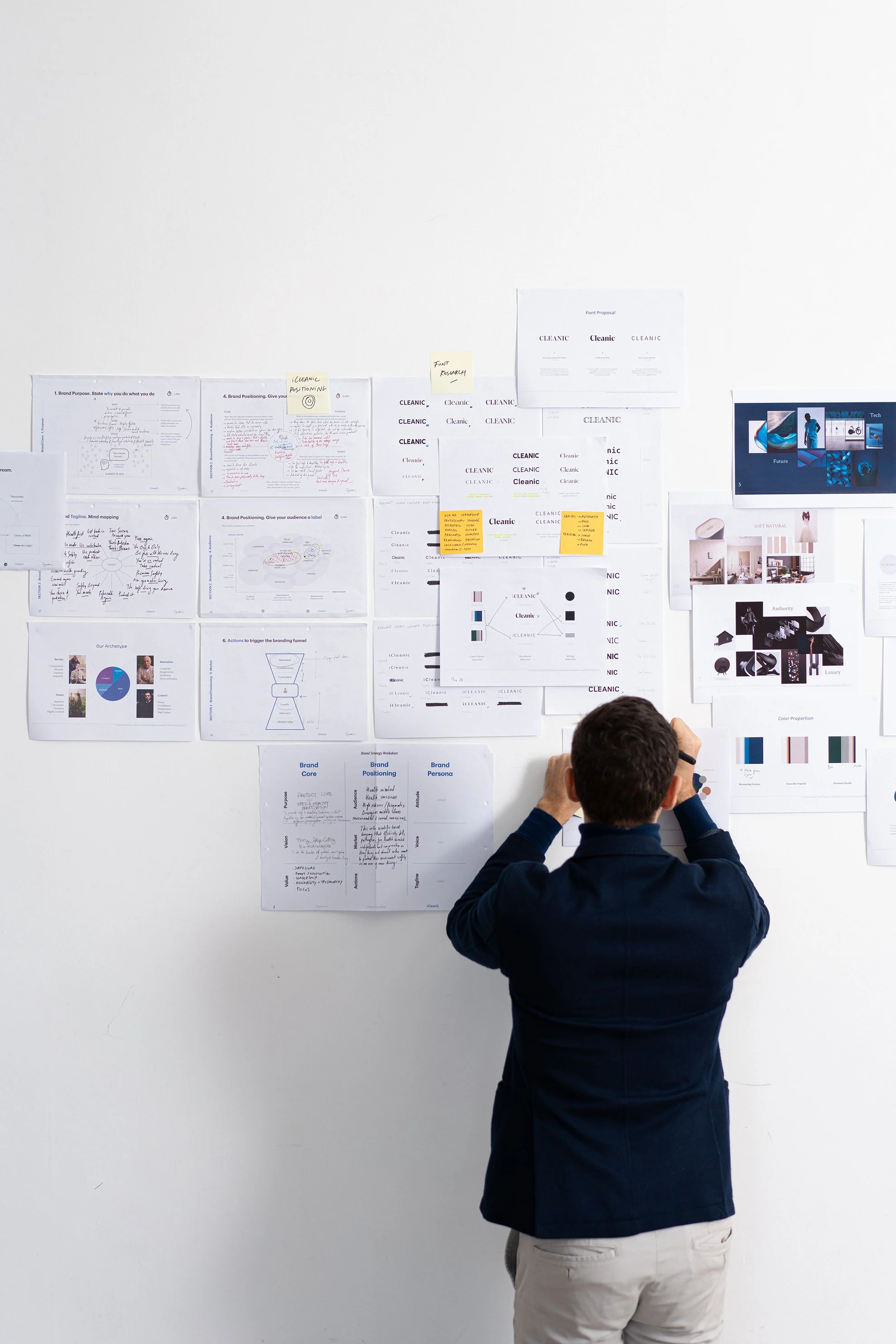
By establishing their brand identity through logo, font and colour schemes while integrating design across its product, packaging and website, our team conceived a comprehensive language that visually communicated their clinically proven solutions for clients who value precautionary measures.
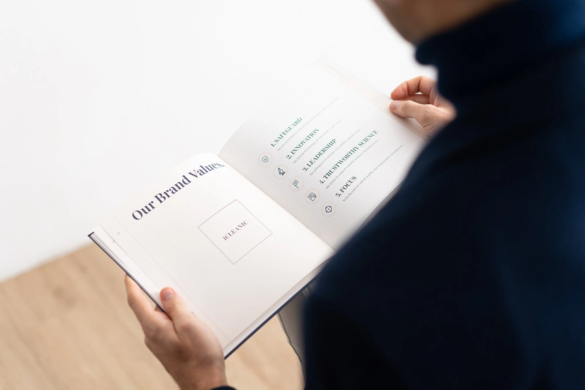
The overarching result delivered brand image alongside physical & digital experiences in a way that was relatable, reassuring and highly supportive, with technology-backed prevention at its core.


Logotype & Monogram
Our logo design set out to rationalize iCleanic’s technology in symbolic form for a new endemic age.
Representing clinical efficiency and expertise, the final logo is conceived in a bold square that typifies the brand’s robust sanitisation products, with an accompanying monogram designed as a contemporary depiction of the traditional medical cross – symbolizing the modernity of its innovative solutions.
A deep Oxford blue background is positioned complementarily behind a white serif font of defined capital letters, a clear and instantly identifiable name backed by a colour palette of safety and protection.


Identity
To complement the logo, iCleanic’s image and identity mirrored the tenets of technology in service of the individual’s health. Colour palettes embrace the brand’s deep Oxford blue as a primary hue, with a brighter royal blue employed in variations.
Earthy shades of grey and taupe are weighed against greens of sacramento and sage, implying solutions sourced from nature. Typography offsets niche Passenger Display serif font with familiar Calibri sans-serif to contrast definition with accessibility, while iconography is enhanced by pictograms to efficiently deliver crucial information across languages and barriers.

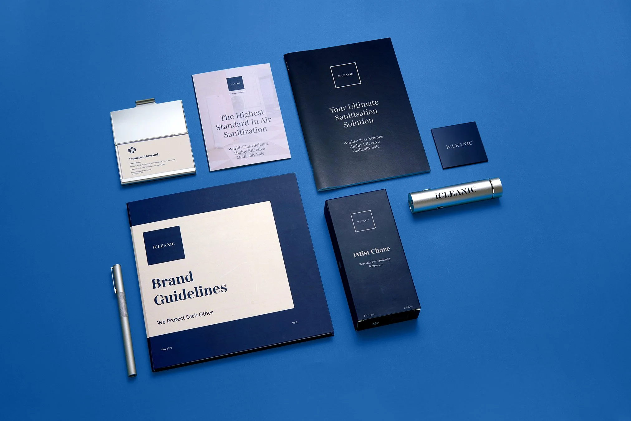


Products & Packaging
As sanitisation and sterilization quickly became expected elements of a post-COVID world, iCleanic’s product range had to critically deliver direct solutions that seamlessly equalised state-of-the-art technological innovation with universal accessibility. Designs reflect that crucial balance, where traditional medicinal profiles blend with sleek, streamlined forms, for shapes and silhouettes that signify reliability and expertise.
Packaging mirrors in both form and intention, be it commercial-grade air sanitizers or portable hand sprays, modernising pharmaceutical box designs with bold, device-like front designs, while rear sides detailed essential information in easy-to-read text and iconography.

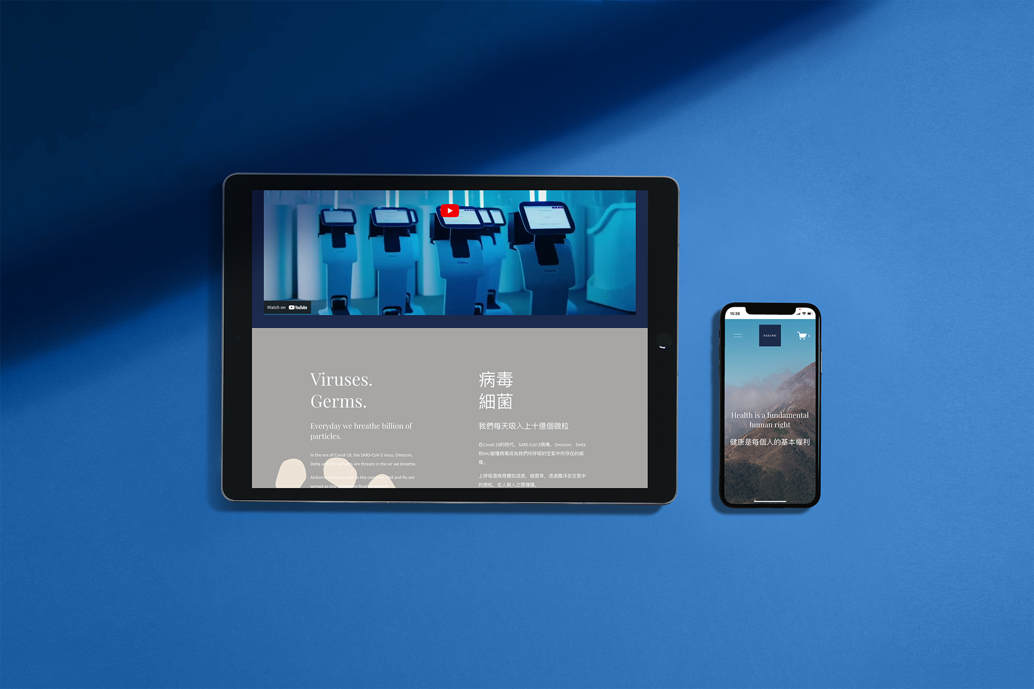
Brochure Website
iCleanic’s website was purposely structured and designed on traditional healthcare principles: clean, professional, methodical and with clear communication employing warm tonal language.
The overall digital experience emphasizes the brand’s technological expertise, seamlessly balanced by an unobtrusive customer service approach promisingsolutions for any application.
Mobile-friendly long scroll pages blend clean visuals of bright imagery and creative videos with succinct, bold copy, against contrasting backgrounds of sanitary medical whites, convivial earthy tones and the brand’s deep navy blue.