

Year
2024
Client
Raja Fashion
Sector
Luxury Retail
Disciplines
Brand Strategy
Brand Identity
Art Direction
Aristo
Trusted for over 50 years in Hong Kong, Raja Fashion rebranded as ARISTO in 2024. The fourth generation set out to refine its legacy into a brand defined by craftsmanship, education, and exclusivity.
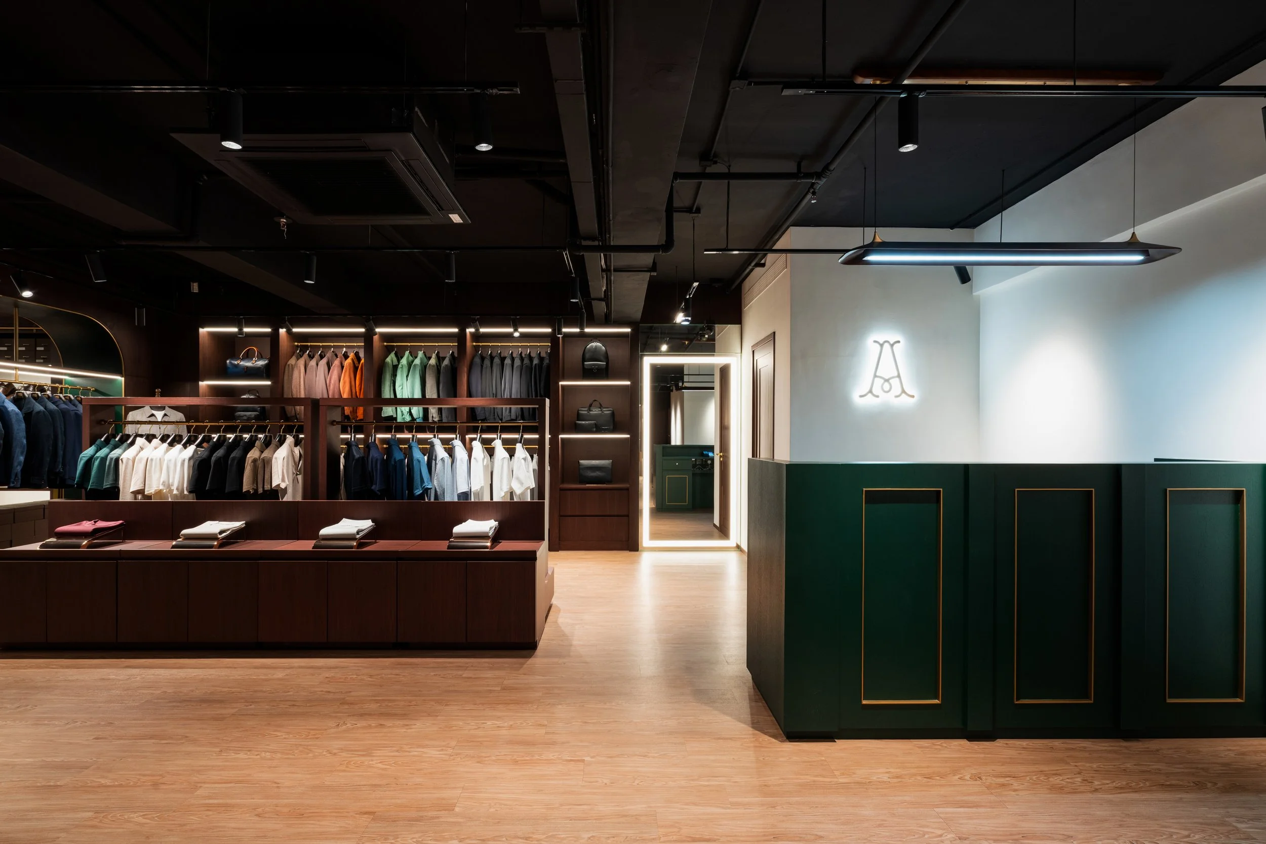
Moving from walk-in tailoring to an invitation-only atelier, ARISTO revives a 1970s family name while embracing Modern Sartorialism.
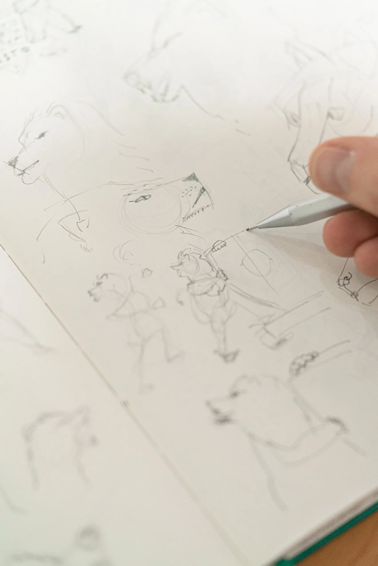
The owner approached us to redesign the brand’s strategy and identity, translating decades of heritage into a contemporary framework. This case study shows how design anchored ARISTO’s evolution into Hong Kong’s next tailoring reference.


The Monogram
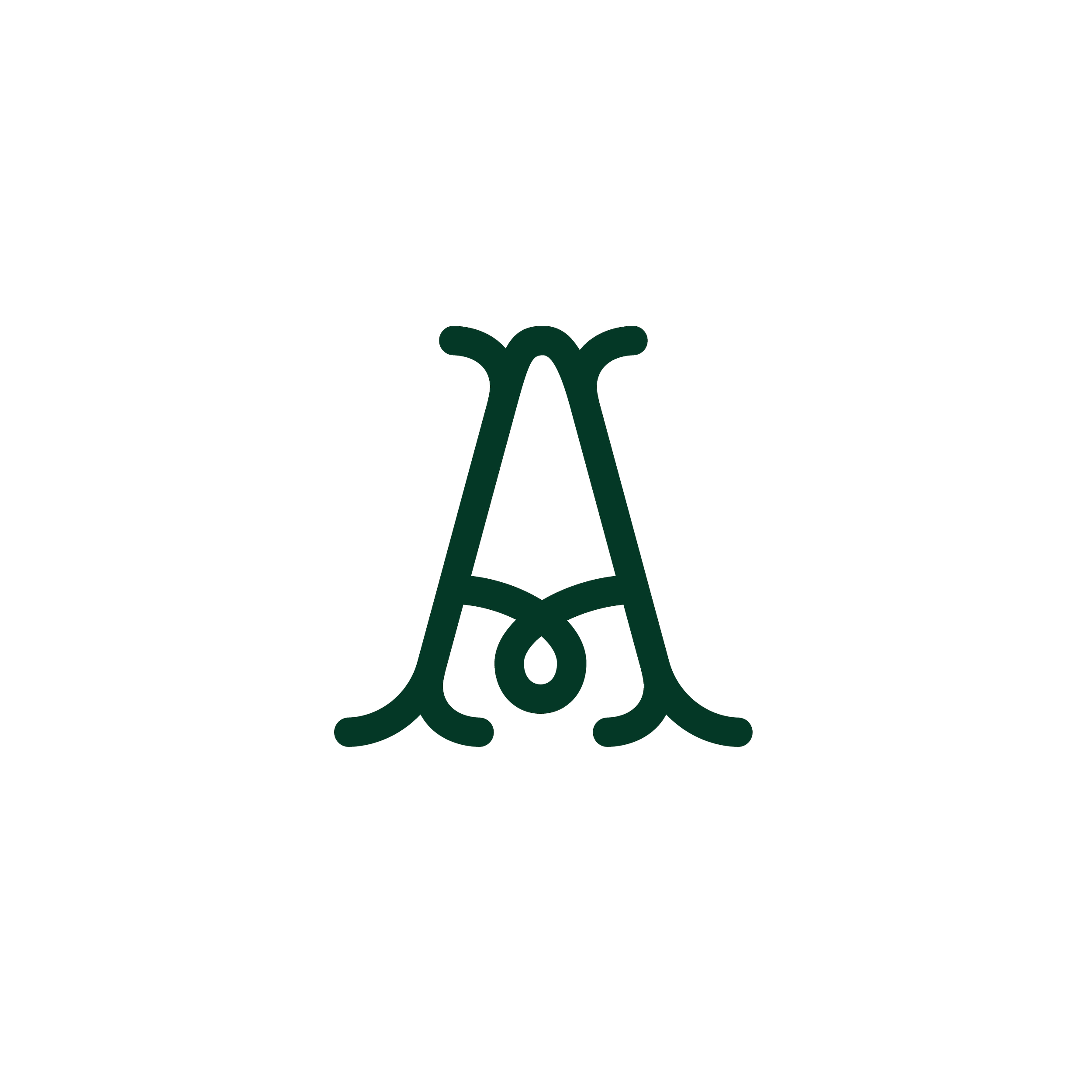
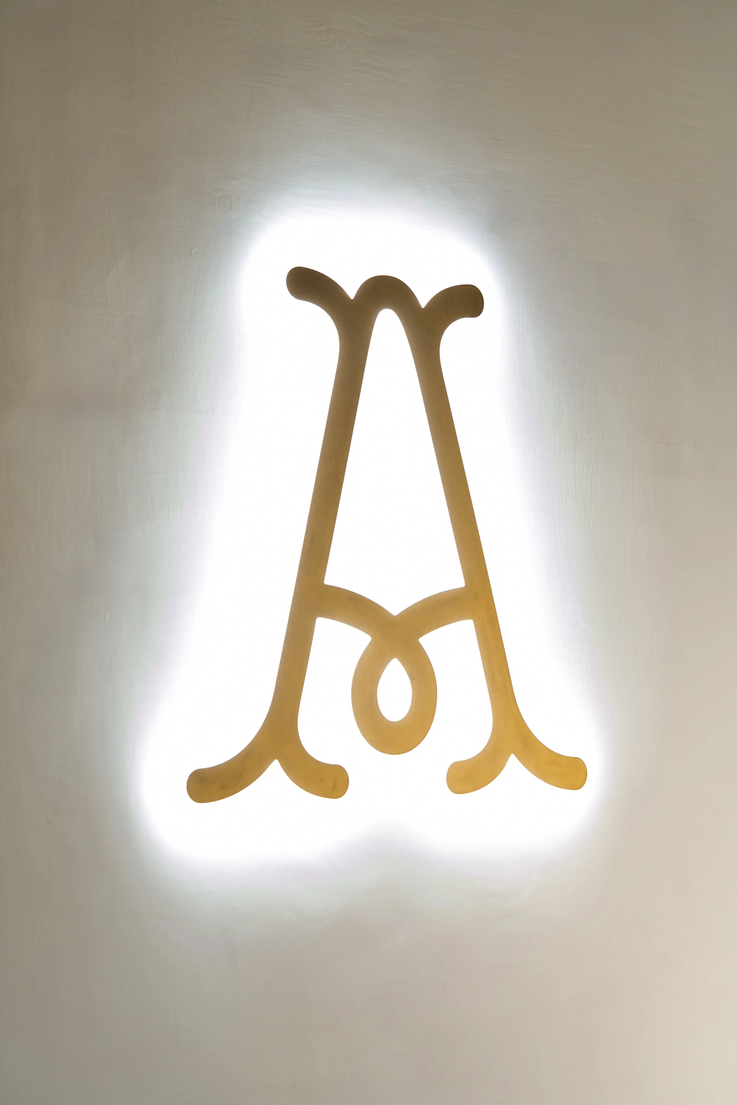
The ARISTO monogram distills the brand into a compact, versatile mark. Designed for clarity at small scales, it ensures recognition where the full crest or wordmark would lose impact.
It adapts seamlessly across digital platforms, social avatars, and print details. It is a modern insignia built for adaptability without losing heritage.
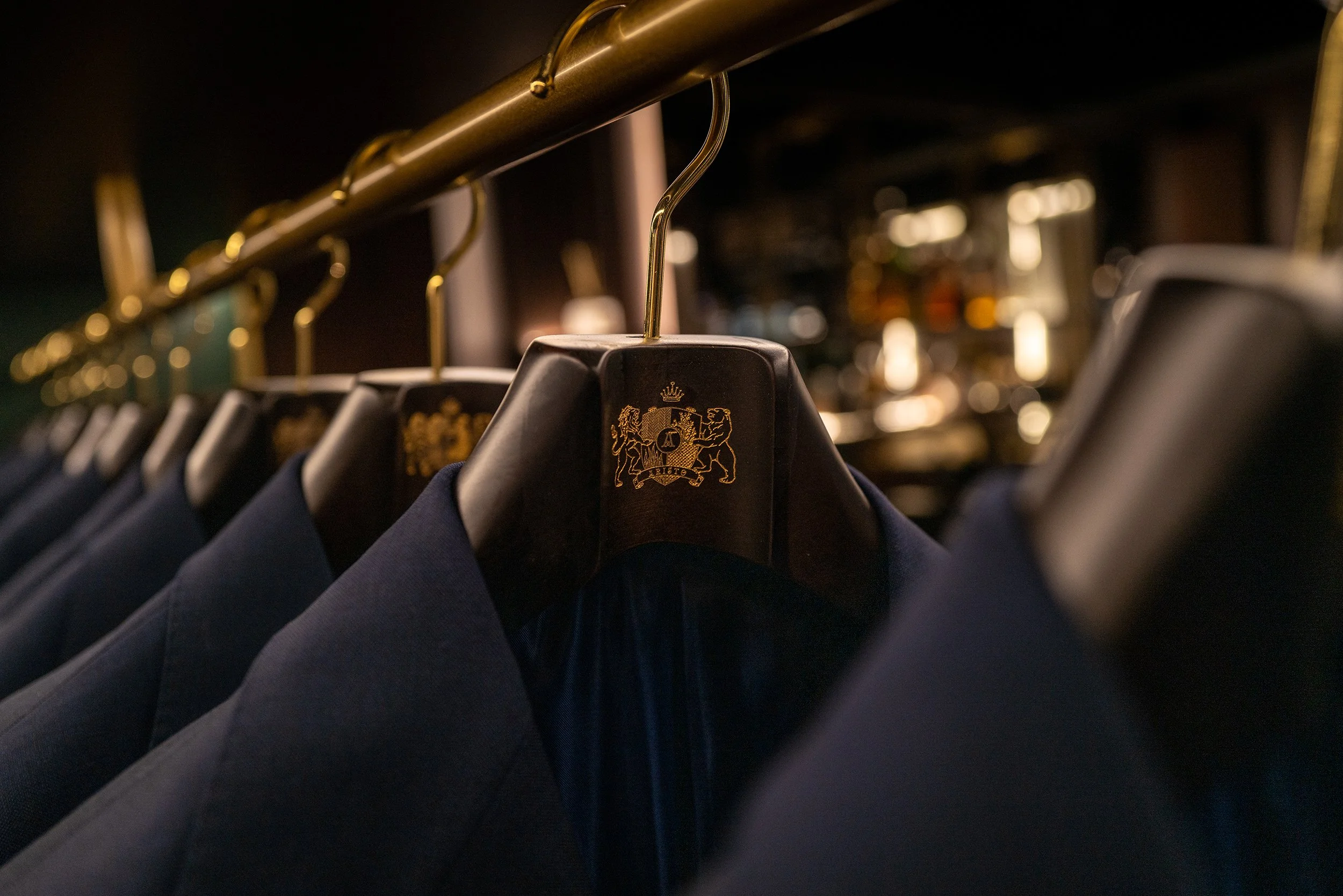
The Crest
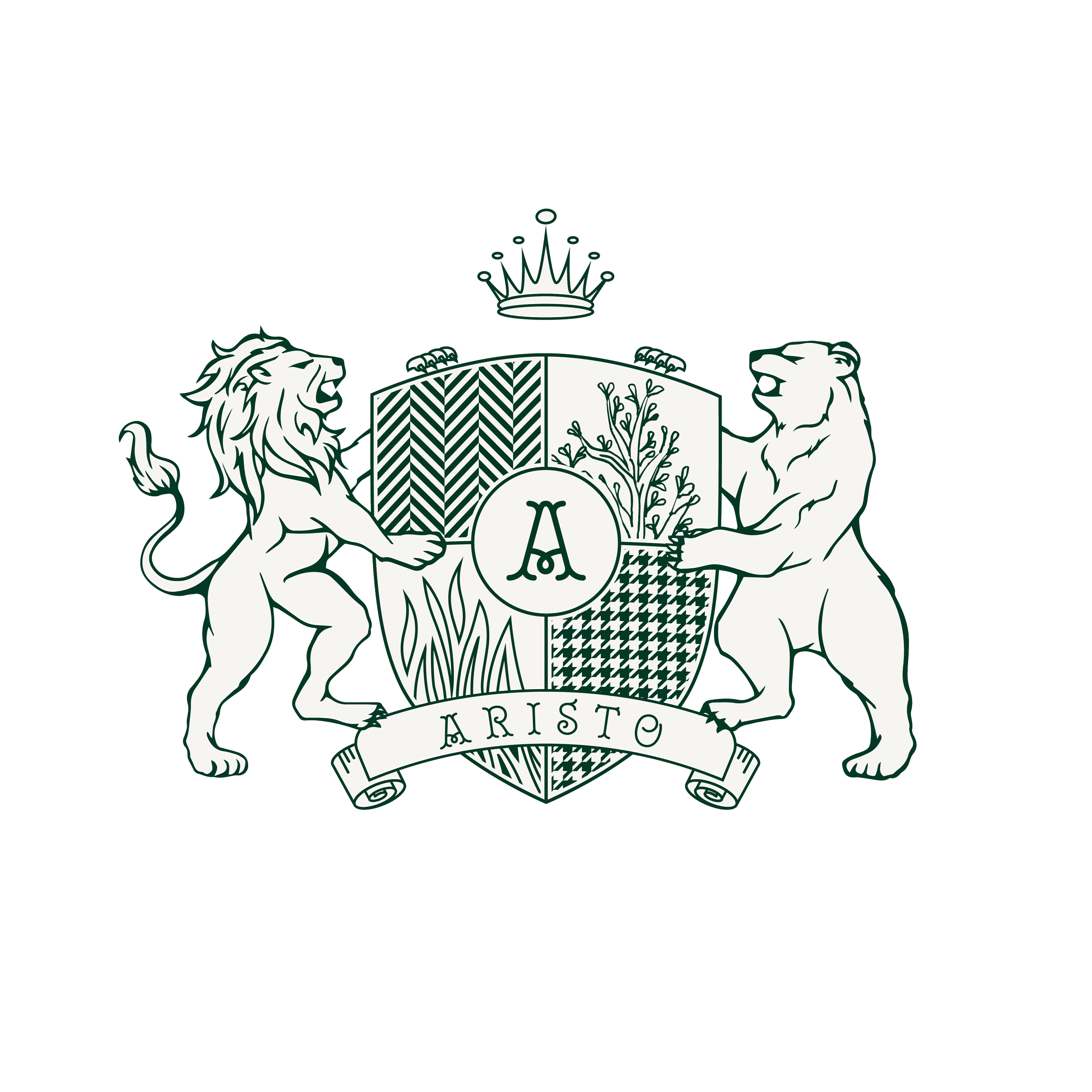
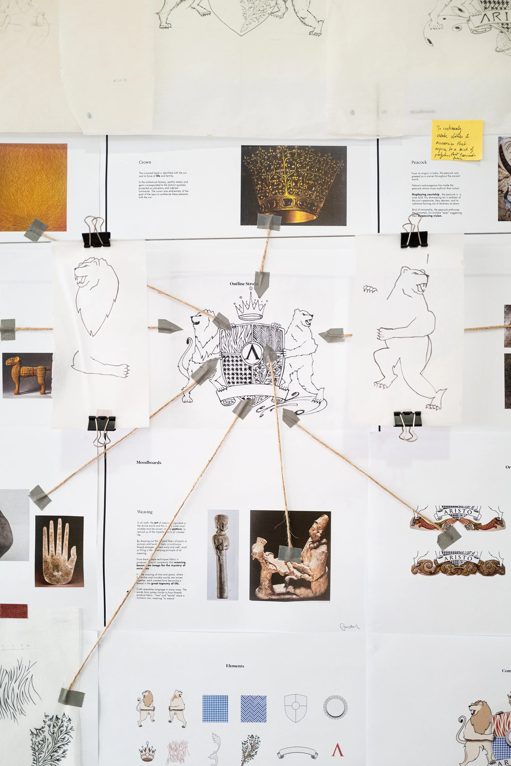
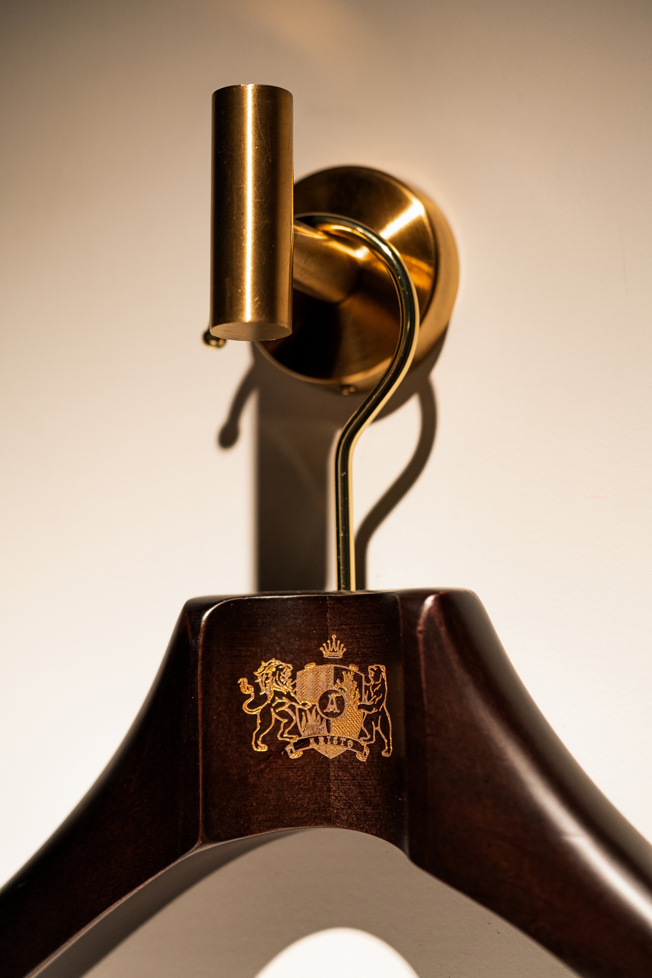
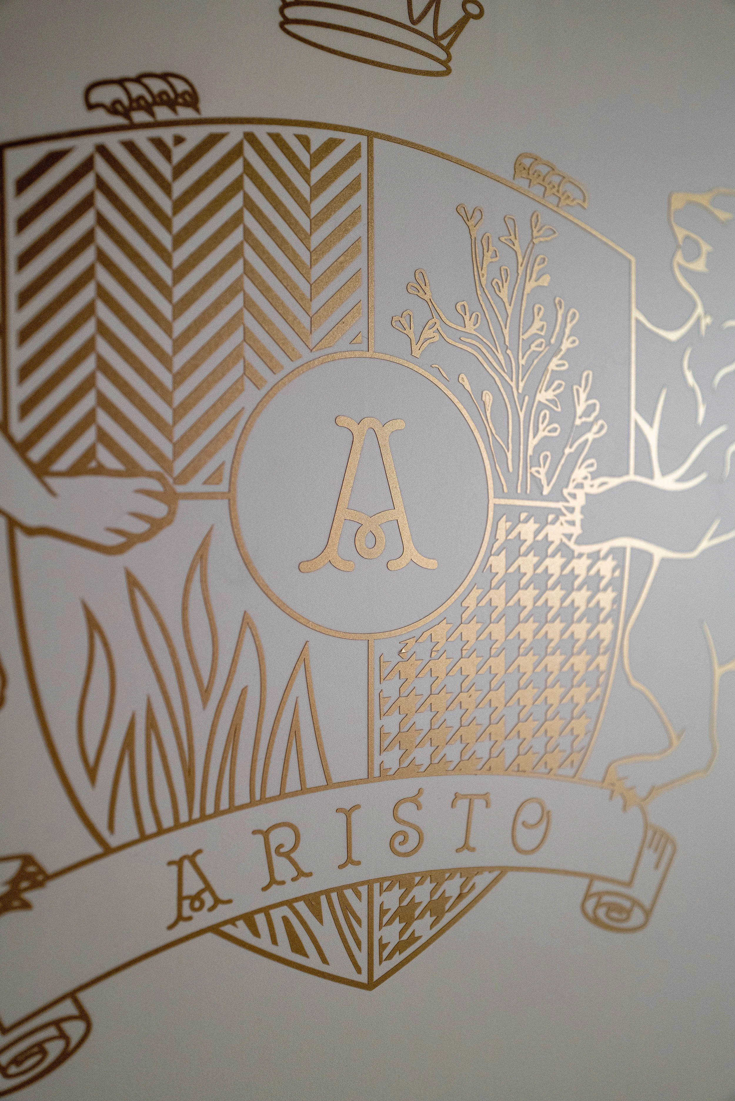
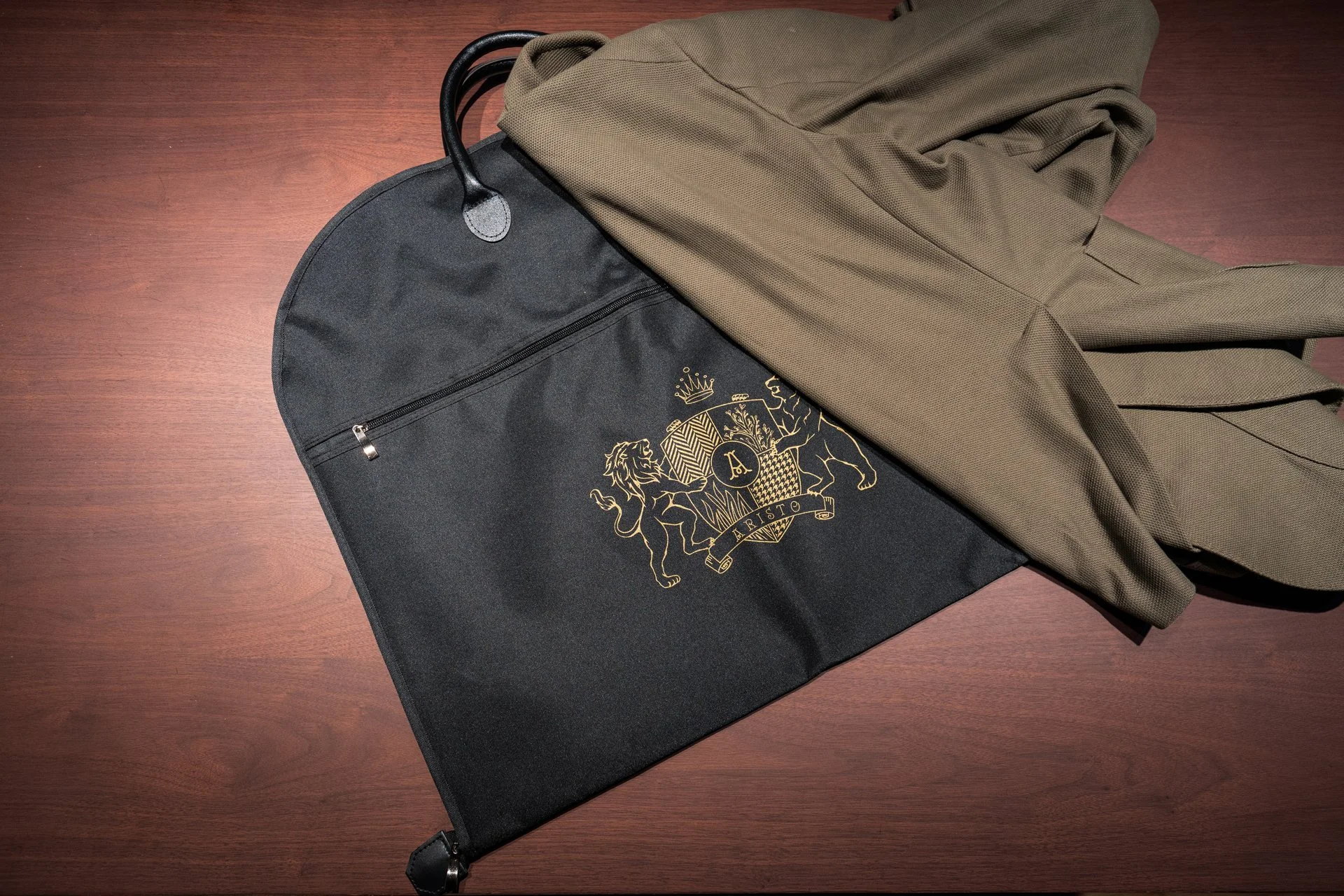
The ARISTO emblem is a crest of symbols drawn from both heraldry and tailoring.
A lion, crown, shield, and bear express strength, leadership, heritage, and resilience. Fire signals creativity, while the tree anchors wisdom and legacy. Houndstooth and herringbone patterns root the mark in textile tradition, balanced by a ribbon symbolising precision and a central monogram for modern clarity.
The crest is not ornamental, it is ARISTO’s immediate signature, embodying heritage, craftsmanship, and authority.

Materiality
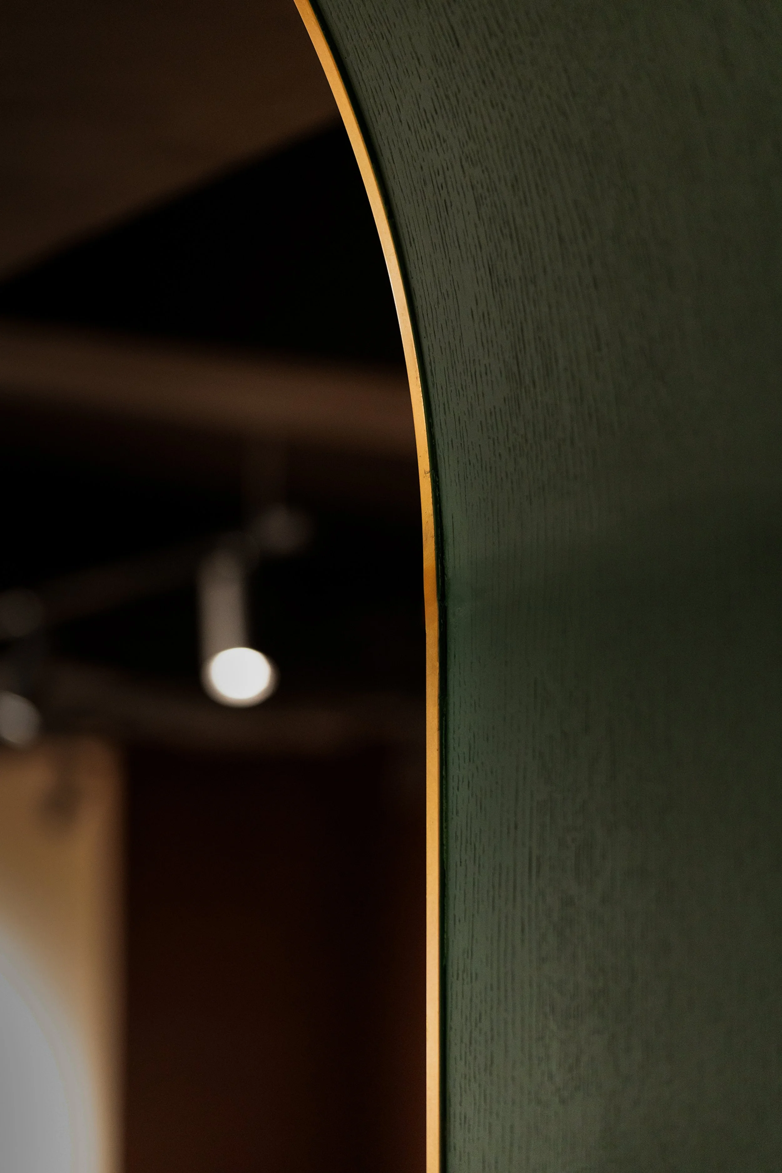
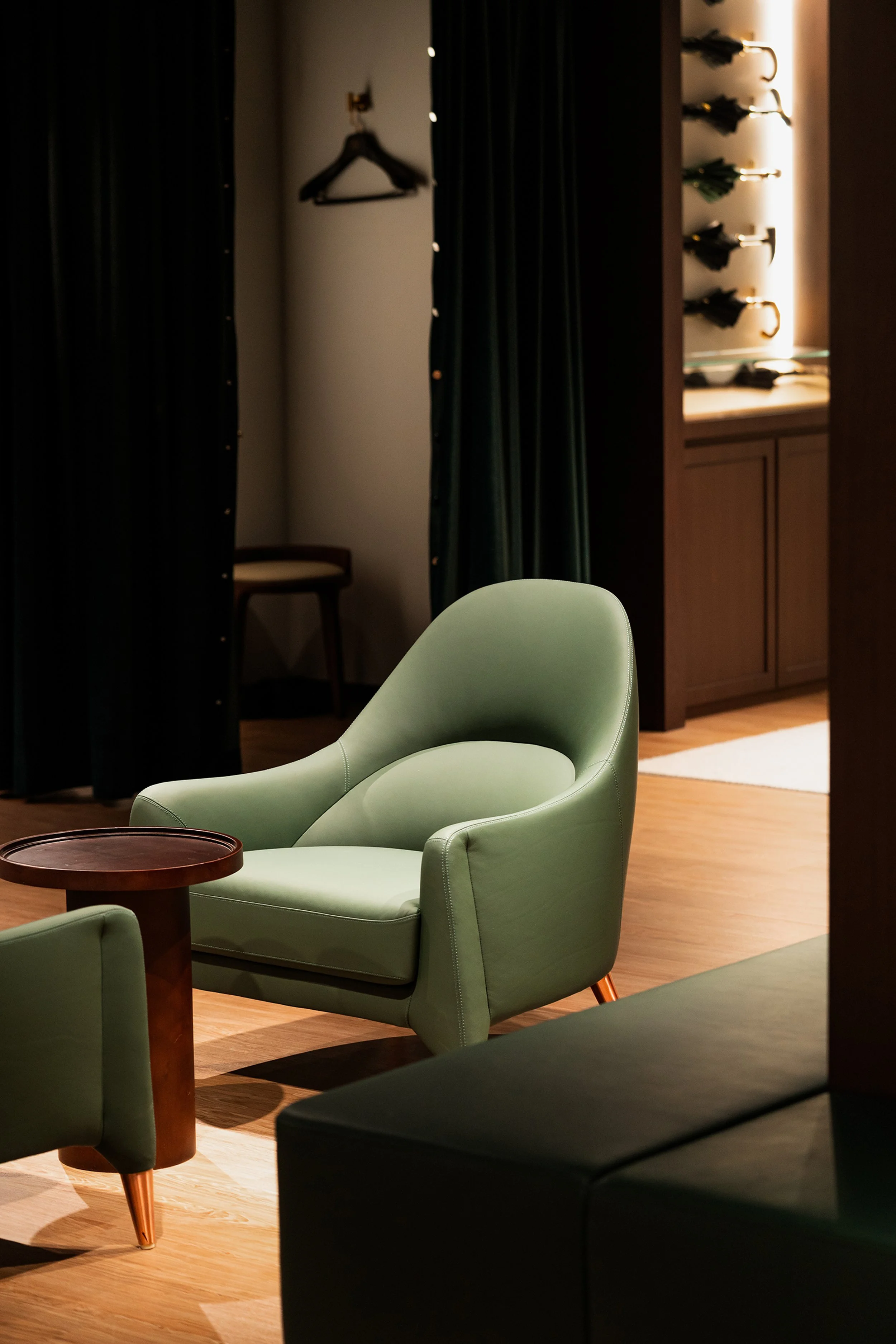
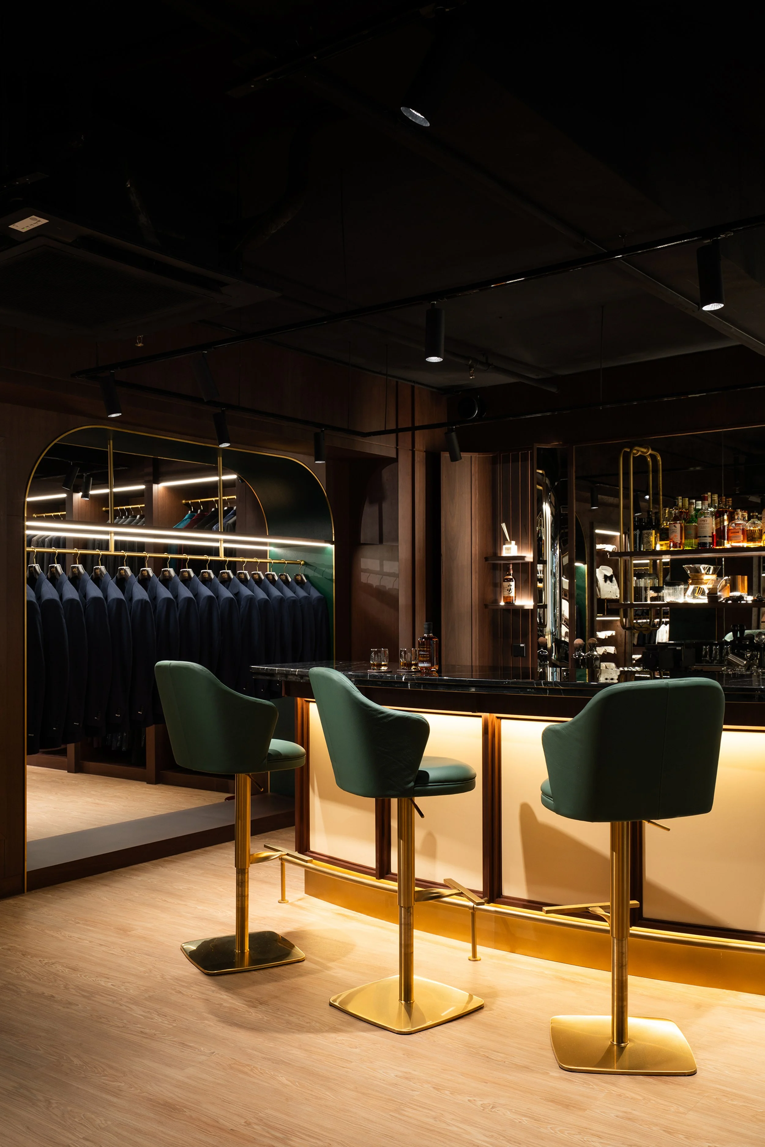
ARISTO’s palette balances heritage and refinement. The primary shade, Sacramento green, conveys growth, prosperity, and quiet authority.
Mahogany and Antique Gold act as accents, introducing depth, nobility, and a touch of luxury.
Sage tints and Velvet neutrals provide softness and versatility across digital and print. This restrained palette ensures elegance, consistency, and timeless resonance, while reinforcing ARISTO’s position in the world of bespoke tailoring.
It is a palette of deep heritage tones refined for modern luxury.
The Wordmark
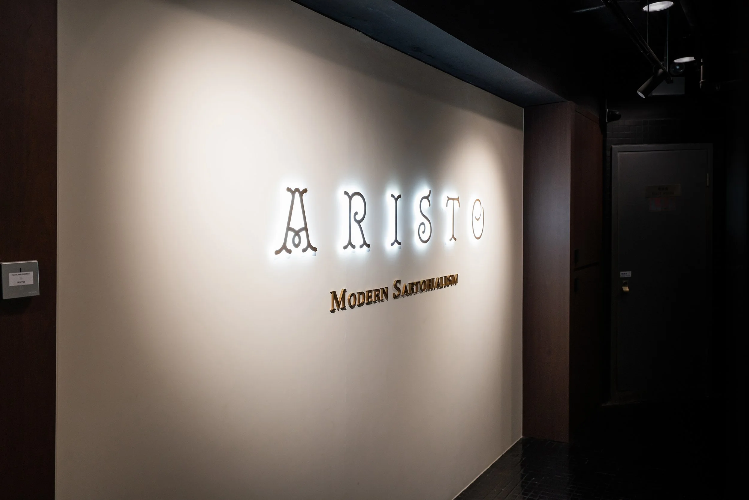
The ARISTO wordmark is set in the Royale typeface, a refined serif chosen exclusively for the logotype.
Its all-caps lettering with generous spacing conveys authority, timelessness, and quiet luxury. Primary use in Sacramento green, supported by Mahogany and Antique Gold accents, ensures adaptability across applications, with black and white variants for clarity.
Together with the crest and monogram, the wordmark anchors the brand system. It embodies heritage, precision, and sartorial authority, positioning ARISTO as Hong Kong’s modern tailoring reference.




“Working with Francois on the Aristo identity was one of the more important decisions we made in the move from Raja Fashions to a proper atelier.
He did not treat heritage as decoration. He treated it as the material, and shaped a brand around craftsmanship, education, and a more exclusive way of working.
He is rigorous, collaborative, and unusually good at turning a family business into a contemporary brand without losing the reason it exists.”
Client: Aristo. Founder: Prashant Daswani
Interior Design Direction: LC Studio, Louis Matthieu Chon, Chow SY
Photography: Studio8ight
Art Director: Pak Chung
Visual Identity & Strategy: François Hurtaud