
The Design of Everyday Things: A Practical Guide to Making Magic Happen
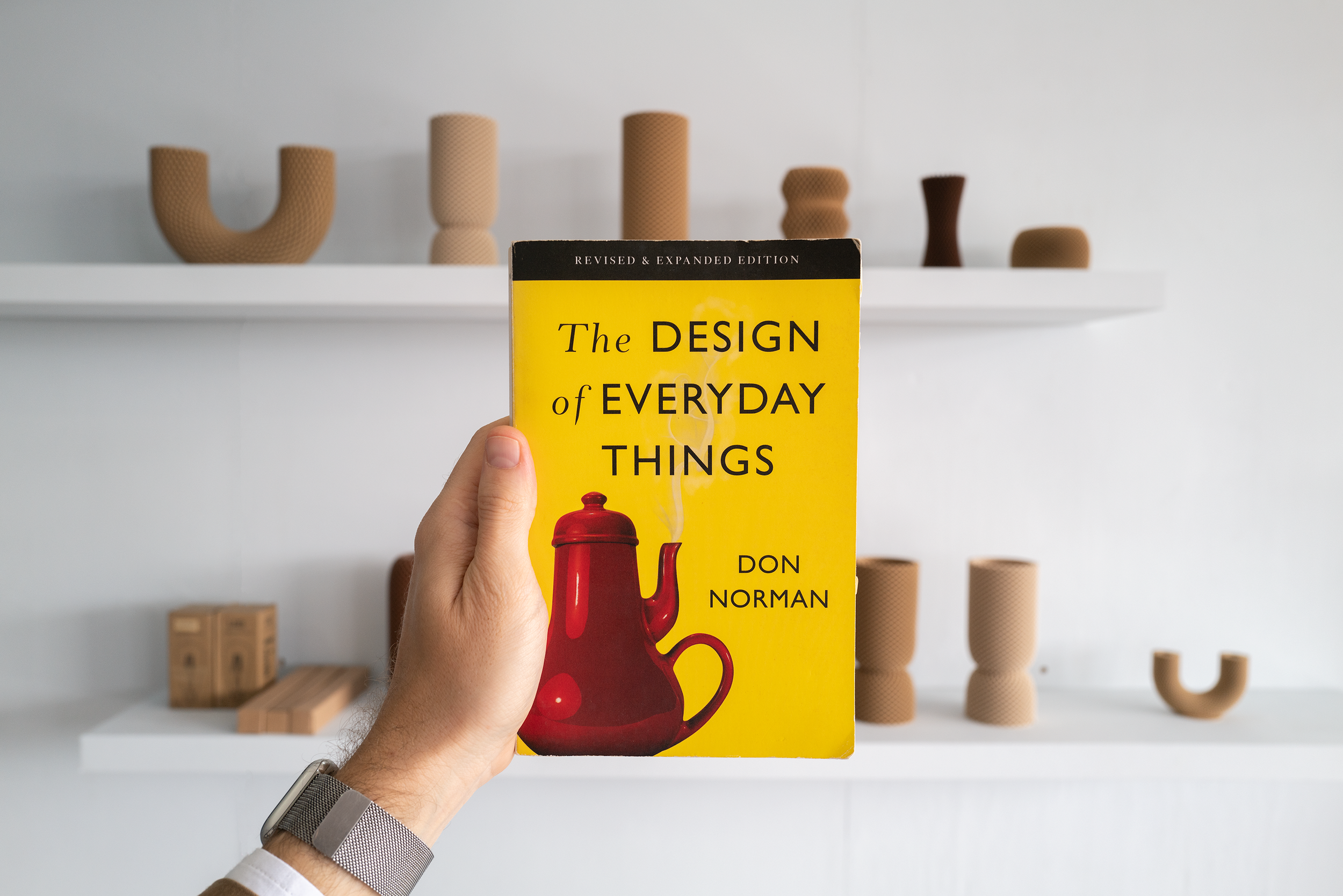
Don Norman, in his book The Design of Everyday Things, made a profound observation: "Good design is actually a lot harder to notice than bad design." Why? Because good design fits our lives so seamlessly, it becomes invisible. It works so well, you forget someone spent countless hours agonizing over the details. But bad design? Oh, it announces itself with all the subtlety of a car alarm at 3 a.m., demanding your attention as you fumble with frustration. Bad design is so loud. Think about the last time you used a door labeled “Push” but instinctively pulled. Was that your fault? Nope. That’s poor design screaming its inadequacy. Good design, in contrast, guides you without labels. It whispers, “This is how you use me,” and you instinctively follow.
This post explores the principles of good design, why psychology matters when designing, and how we can turn “everyday things” into delightful user experiences. With practical examples from some of the work we do in the studio, let’s try to see how we can make the world a more functional and beautiful place.
The Psychology of Everyday Things

The Gulf of Evaluation & Execution
Everyday, we interact with countless of objects, most of them unconsciously. When we are confronted with a new product, we need to learn how to use, or do we? Great design is often unnoticeable, this is because great design bridges two gaps without any frustration on our end.
The Gulf of Execution: Can I figure out how to use this?
The Gulf of Evaluation: Does the product’s feedback align with my expectations?
The Gulf of Evaluation shows how much effort is needed to understand a device's status and see if it meets expectations. This gulf is smaller when the product clearly shows its state in a way that is easy to understand and aligns with the user's thoughts. Here, good feedback and a clear model help reduce this gulf.
The Gulf of Execution is managed using signifiers, constraints, mappings, and a clear model (more on this below). Here, feedback is the key. It must be iImmediate (users shouldn’t have to wait to see results) and informative (a gentle chime when the microwave finishes, for example, reassures the user the task is complete).
The Psychology of Good Design: Discoverability and Understanding
Two cornerstones of great design:
Discoverability: Can users figure out what actions are possible? Is it is possible to even figure out what actions are possible and where and how to perform them?
Understanding: Once they act, do they understand what happened and why? What does it all mean? How is the product supposed to be used? What do all the different controls and settings mean.
To achieve this, designers rely on five psychological concepts:

1. Affordances: What can I do with this?
Affordance describes how a physical object relates to a person. Anti-affordance means stopping interaction. For these concepts to work well, they need to be easily seen and understood. Visible affordances give clear hints about how to use things. Affordances show the possible interactions between people and their environment, but not all are obvious. Perceived affordances help people know what actions they can take without needing labels or instructions (they often serve as signs but can sometimes be unclear). Commonly, perceived affordance creates a shared experience for everyone.

2. Signifiers: How do I do it?
Signifier indicate where actions should occur. This includes any marks or sounds that show how to behave. Signifiers point to what actions can be taken and how to perform them. If the signifiers are not noticeable, they do not work.
For example, handwritten signs on doors, switches, or products telling how to use them highlight poor design. Using sound as a signifier is important. Sounds can provide feedback about what is happening, while silence can lead to confusion and a lack of information (with electric cars for example).

3. Constraints: What limits my actions?
Physical constraints like a lockey limit what can be done. A contraint can also be cultural, colors for instance can have different meanings according in different societies or religion. We also follow what we call semantic constraints, for example a conductor require to face the road, affecting seat placement. Another type of constraint is logical constraints. It involves the relationship between the layout of parts and their effects on each other (e.g., with three lights, if two are on, we can determine the status of the third).

4. Mappings: How do the controls correspond to the results?
Mapping is the relationship between the elements of two sets of things. (i.e stoves, car window, home switches) Natural mappings: What seems natural in one culture may not be in another. Natural mappings differ greatly between cultures, showing that what seems obvious in one place may not be in another. For instance, different cultures view time in unique ways. For example, some see time as a path ahead, where a person moves forward, while others see it as the future approaching a stationary person.
The best design is when controls are directly on the item they manage. The next best is when controls are close to the item. The third option involves controls arranged like the items they control. Mappings often lack clear signs, making them harder to understand.

5. Feedbacks: Does the product tell me what just happened?
Feedback must be immediate and delivered without delay. It should always be informative, providing clear and useful insights. If there are too many announcements made in a short span of time, people may begin to ignore them or overlook their importance. That’s why it is important fo for the feedback to be provided in a rapid timeframe, the magic number here is 0.1 seconds. This maintain engagement and effectiveness.
Three Levels of Processing Everyday Actions
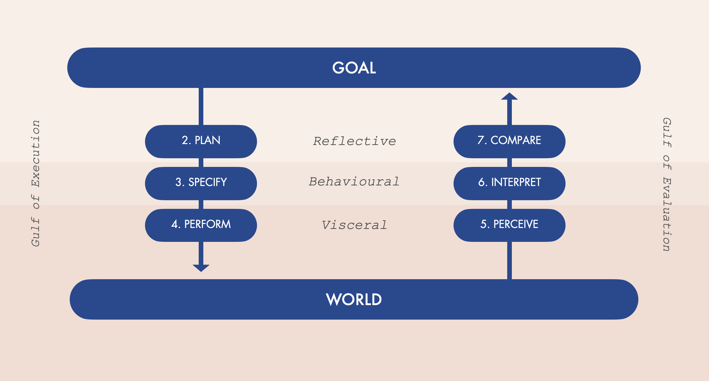
Don Norman breaks down human interaction into three layers:
Visceral: Immediate, instinctive reactions. Is the object visually appealing? Does it feel good to hold? Here is where the style matters. Our reactions through sound, sight, touch, or smell influence how we feel. This is different from how well a product works. It’s about what attracts us or repels us. Great designers use visual appeal to create these strong feelings.
Behavioral: How well does it function? Does it meet our expectations and give satisfying feedback? When designing products, the key point here is that every action comes with an expectation. A positive expectation leads to a positive emotional response, while a negative expectation results in a negative emotional response, such as fear or hope, anxiety or eagerness (cf: The Emotional Ladder). Feedbacks helps to confirm (or challenge) these expectations, leading to feelings of satisfaction (or disappointment). Behavioral states are learned and can create a sense of control when outcomes are clear, or anger when things go wrong, especially without understanding the causes or solutions. Feedback provides reassurance, even if the news is bad. Without feedback, people often feel out of control, which is distressing. Feedback is essential for managing expectations, and effective design facilitates this. It is through feedback that expectations are addressed, which is vital for learning and developing skilled behavior.
Reflective: What story does it tell? Does it align with our values? Would we recommend it? Reflection drives us to recommend a product, to recommend that others use it or perhaps, avoid it.
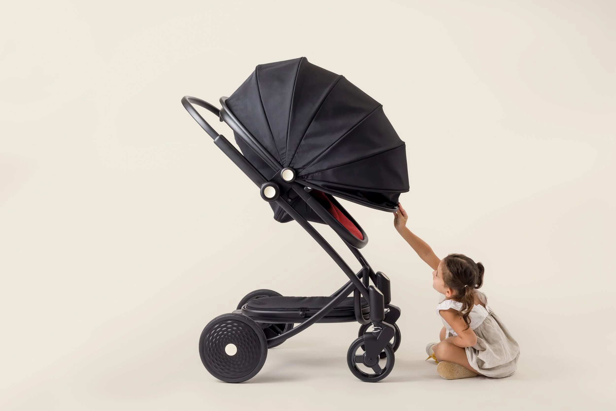
When designing the Eloise Pram, we focused heavily on these layers:
Visceral: The pram’s sleek aesthetic makes it a delight to look at.
Behavioral: Its modular design folds effortlessly, making life easier for busy parents.
Reflective: By eliminating the need for a separate newborn bassinet, it tells a story of sustainability and thoughtful engineering.
There is no Error, only bad design
Humans make mistakes. We all do. Lots of them. It’s not because we’re incompetent; it’s because the world is complex. Good design doesn’t blame users—it anticipates errors and mitigates their impact.
It is relatively easy to design for a situation where everything goes well, where people use the device in the way that was intended, and no unforeseen events occur. The tricky part is to design for when things go wrong. Because errors are inevitable. The best designs take the facts into consideration and seek to minimise the opportunity for errors while also mitigating the consequences. Assume that every possible mishap will happen, so we should be ready to protect the user against them. As designers, we should make actions reversible, and make errors less costly. We distinguish two type of errors:
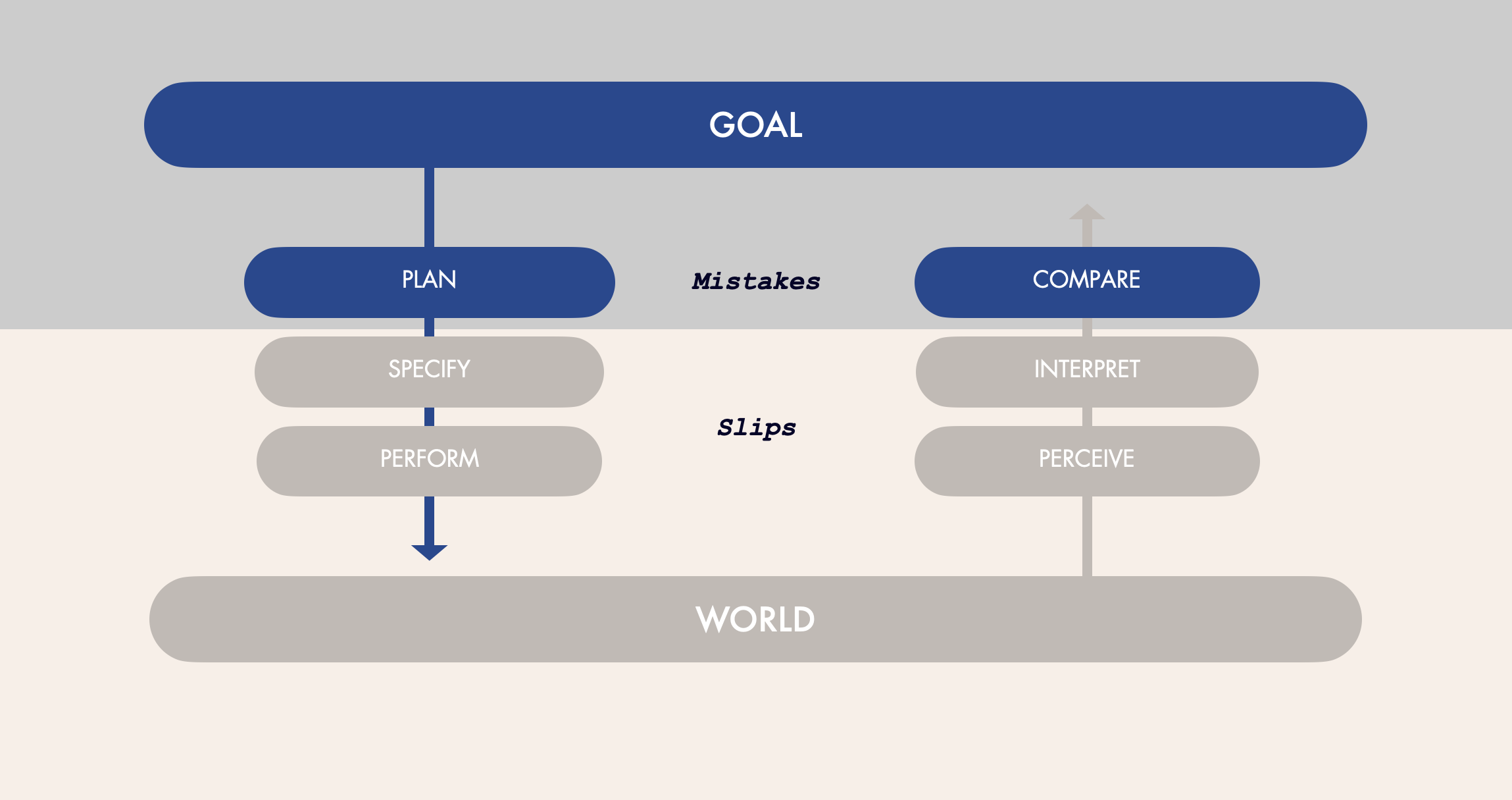
MISTAKES
You followed the wrong plan, like turning the thermostat to max heat, thinking it’ll make your room warm faster.
A rule-based mistake happens when someone correctly understands a situation but then acts incorrectly by following the wrong rule. For example, setting an oven's thermostat to the highest temperature or misusing anti-lock brakes in a car.
Knowledge-based mistake: The issue is misunderstood due to incorrect or incomplete information. (fuel weight calculated in pounds instead of kilograms).
Memory-lapse mistakes happen when we forget goals, plans, or evaluations. Mechanics may not finish troubleshooting due to distractions.
SLIPS
You intended to do the right thing but executed it incorrectly (e.g., pouring coffee into the sugar jar).
Action-based slip: The wrong action is performed. (ex: putting hot coffee in the fridge)
Memory lapse slip: Memory fails so the intended action is not done or its result not evaluated. (ex: forgetting to turn off the gas)

Venue was designed to reduce user errors and slips, leading to better cleanliness in busy areas.
Forcing Function serves as a method for error-proofing design, commonly referred to as Poka-Yoke, which was introduced by Shigeo Shingo at Toyota. The term translates to "error proofing" or "avoiding mistakes." This approach utilizes straightforward tools or arrangements to guarantee that tasks are executed accurately. The follwoing steps can enhance the reliability of designs, ensuring tasks are performed correctly and efficiently.
Identify the reasons for errors and design to reduce them.
Conduct common sense checks. Does the action seem reasonable?
Allow actions to be reversed or make it harder to perform irreversible actions.
Help users find and fix errors easily.
Don’t see the action as a mistake; instead, help the person do it correctly. Consider the action as a step towards what they want.
During the Covid-19 pandemics, we were tasked to redesign an industrial, utilitarian sanatizer. The mistake here was that visitors were not using the device because the motion sensor was placed to high, and crucially, they did not know they had to activate the device the first place. Our solution was to play with visitors’ vanity: we place a mirror panel inviting everyone around to look at themselves, subsequently activated the motion sensor to trigger the sanitization.

Here at the studio, we embrace resilience engineering. This philosophy aims to:
Eliminate opportunities for error. (Cf: Room Sanatizer)
Minimize the impact when errors occur. Take SeaDifferently toothbrush design: the replaceable head can only attach one way, ensuring users don’t waste time trying to force it into place incorrectly. It’s simple, foolproof, and effective.
The Challenge, and the joy of Design
We designers face a tricky balancing act. A product must be usable and understandable, be attractive and enjoyable., stand out from competitors, and, let’s not forget—be manufacturable and affordable. Consider faucets. Yes, faucets. We’ve all been frustrated by designs where hot and cold are ambiguous, or where the water sprays everywhere except your hands. A well-designed faucet blends form with function seamlessly.
We should use design as a way of embracing positive psychology. Positive design principles remind us to focus on helping users succeed rather than highlighting their failures. Some golden rules to keep in mind:
Don’t blame users for mistakes. Use their struggles as signifiers to improve your product.
Eliminate error messages. Instead, offer helpful guidance to correct mistakes.
Make errors reversible wherever possible.

We should focus on solving the right problem. A brilliant solution to the wrong problem is worse than no solution at all. We must dig deep through design research to uncover the real issue before jumping to conclusions. For instance, when working on the Oliver James ASAP air pump, the challenge wasn’t just to make inflate fast. It was to create a product that would remove the anxiety of over/under inflating soft goods—and so we develop a pump that would automatically stop at the right pressure . By focusing on both the activity (inflating) and the emotion (reassurance), we struck the right balance. Good design is about more than functionality—it’s about creating moments of joy. It’s the soft click when a pram locks into place, the ergonomic grip of a toothbrush that feels just right, or the satisfaction of knowing your product aligns with your values.
At the studio, we believe in crafting products that don’t just meet needs but exceed expectations. After all, design is more than solving problems—it’s about creating a better world, one beautifully crafted object at a time.